Graphs are essential tools for visualizing and analyzing macroeconomic data. They provide a clear and concise representation of complex economic concepts, allowing economists, policymakers, and business leaders to understand economic trends and make informed decisions. Here are some of the most commonly used graphs in macroeconomics:

1. Line Graphs
Line graphs are used to depict the evolution of a variable over time. They are particularly useful for tracking economic indicators such as GDP, inflation, unemployment rate, and interest rates. By connecting data points with lines, line graphs help identify trends, turning points, and fluctuations in economic activity.
2. Bar Graphs
Bar graphs compare the magnitudes of different variables at specific points in time or over different time periods. They are often used to compare GDP growth rates across countries, inflation rates over different months, or unemployment levels by sector. Bar graphs allow for easy visual comparisons and highlight differences between categories or time periods.
3. Pie Charts
Pie charts illustrate the proportional distribution of a variable among different categories. They are often used to represent the composition of GDP, the distribution of household income, or the market share of different industries. Pie charts provide a quick and intuitive way to visualize the relative importance of different components.
4. Scatter Plots
Scatter plots show the relationship between two variables by plotting data points on a two-dimensional graph. They are useful for identifying correlations or associations between economic variables. For example, a scatter plot can be used to examine the relationship between inflation and unemployment (Phillips Curve) or between GDP growth and government spending.
Applications of Macroeconomic Graphs
Graphs for macroeconomics find application in a wide range of areas, including:
-
Economic forecasting: By identifying trends and patterns in economic data, graphs help economists make informed predictions about future economic conditions.
-
Policymaking: Graphs provide policymakers with visual evidence to support their decisions regarding fiscal and monetary policies. They can assess the impact of policy changes and make adjustments accordingly.
-
Business planning: Businesses use graphs to analyze market trends, consumer behavior, and economic indicators to develop informed investment and marketing strategies.
-
Research and analysis: Graphs are essential for researchers and analysts to identify economic relationships and test hypotheses. They can use graphs to explore data, identify outliers, and draw conclusions.
Specific Examples of Macroeconomic Graphs
1. GDP Growth Rate:
Line graphs are commonly used to visualize GDP growth rates over time. The graph below shows the historical GDP growth rate of the United States from 1947 to 2021.
[Image of a line graph showing the GDP growth rate of the United States from 1947 to 2021]
2. Inflation Rate:
Line graphs also depict inflation rates over different time periods. The graph below shows the annual inflation rate in the Eurozone from 2000 to 2022.
[Image of a line graph showing the annual inflation rate in the Eurozone from 2000 to 2022]
3. Unemployment Rate:
Bar graphs are often used to compare unemployment rates across different demographic groups or regions. The graph below shows the unemployment rate by age group in the United States in 2022.
[Image of a bar graph showing the unemployment rate by age group in the United States in 2022]
4. Interest Rates:
Line graphs track the changes in interest rates over time. The graph below shows the historical federal funds rate set by the US Federal Reserve from 1990 to 2022.
[Image of a line graph showing the historical federal funds rate set by the US Federal Reserve from 1990 to 2022]
Conclusion
Graphs for macroeconomics are crucial for understanding economic trends, making informed decisions, and conducting research. They provide a visual representation of complex economic data, allowing economists, policymakers, and business leaders to gain insights into the functioning of the economy and make informed choices. By utilizing a variety of graph types, policymakers, researchers, and businesses can effectively analyze and interpret macroeconomic data, leading to improved decision-making and a better understanding of the economy.
Tables are another powerful tool for organizing and presenting macroeconomic data. They provide a structured and concise way to summarize key economic indicators and compare them across different time periods or categories. Here are some of the most commonly used tables in macroeconomics:
1. National Income and Product Accounts (NIPA) Table
The NIPA table provides a comprehensive overview of the nation’s economic output, income, and expenditures. It includes data on GDP, personal income, corporate profits, and government spending. The NIPA table is a fundamental tool for understanding the overall health and performance of the economy.
2. Input-Output Table
An input-output table shows the interdependencies between different sectors of the economy. It provides information on the goods and services that each sector purchases from and supplies to other sectors. Input-output tables are used to analyze the impact of economic policies and shocks on different industries.
3. Flow of Funds Table
The flow of funds table tracks the flow of money and financial assets between different sectors of the economy. It shows how savings are transformed into investments and how financial markets facilitate these transactions. The flow of funds table is essential for understanding the financial system and its role in economic growth.
4. Balance of Payments Table
The balance of payments table summarizes the economic transactions between a country and the rest of the world. It records the value of exports and imports of goods and services, as well as inflows and outflows of capital. The balance of payments table provides insights into a country’s international trade and financial position.
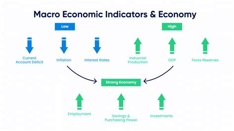
Economic indicators are statistical measures that provide insights into the current and future state of the economy. They are closely monitored by economists, policymakers, and businesses to assess economic conditions and make informed decisions. Some of the most important economic indicators include:
-
GDP: Gross domestic product measures the total value of goods and services produced within a country’s borders over a specific period of time. It is the most comprehensive measure of economic output and growth.
-
Inflation rate: The inflation rate measures the percentage change in the prices of goods and services over time. High inflation can erode the purchasing power of households and harm economic growth.
-
Unemployment rate: The unemployment rate measures the percentage of the labor force that is unemployed. High unemployment can lead to social unrest and economic hardship.
-
Interest rates: Interest rates are the cost of borrowing money. They influence investment, consumption, and economic growth.
-
Consumer confidence: Consumer confidence measures the level of optimism among consumers about the economy. High consumer confidence can boost economic activity, while low consumer confidence can lead to a slowdown.
-
Business investment: Business investment measures the capital expenditures made by businesses. It is a key driver of economic growth and productivity.
-
Exports and imports: Exports and imports measure the value of goods and services sold to and purchased from other countries. They are important for economic growth and international trade.
Graphs and tables are essential tools for economists, policymakers, and business leaders to analyze macroeconomic data and make informed decisions. By visualizing economic trends and relationships, economists can better understand the functioning of the economy and make accurate predictions about its future trajectory. Tables provide a structured and concise way to summarize key economic indicators and compare them across different time periods or categories. By combining graphs and tables with economic indicators, policymakers and business leaders can effectively analyze and interpret macroeconomic data, leading to improved decision-making and a better understanding of the economy.