Introduction
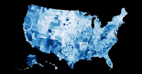
Choropleth maps are a type of thematic map that uses colors or shades to represent the distribution of data across a geographic area. They are commonly used in AP Human Geography to visualize the spatial patterns of various social, economic, and environmental phenomena.
How to Read a Choropleth Map
Choropleth maps consist of several key elements:
- Base Layer: The geographical outline of the area under study.
- Data Values: The numerical values being represented on the map.
- Color Scheme: A gradient of colors that corresponds to the range of data values.
- Legend: An explanation of the color scheme and data values.
To interpret a choropleth map, simply identify the color corresponding to the geographic area of interest and refer to the legend to determine the corresponding data value.
Types of Choropleth Maps
There are two main types of choropleth maps:
- Graduated Choropleth Maps: Uses a continuous gradient of colors to represent data values.
- Univariate Choropleth Maps: Uses a single color or shade to represent each category of data.
Applications of Choropleth Maps in AP Human Geography
Choropleth maps are a powerful tool for analyzing geographic patterns in AP Human Geography. They can be used to:
- Identify spatial trends: Examine the distribution of phenomena across regions, countries, or continents.
- Compare geographic patterns: Visualize similarities and differences in data values between different geographic areas.
- Predict future trends: Use historical data to identify areas with higher or lower likelihood of future events.
Importance of Choropleth Maps in AP Human Geography
Choropleth maps play a crucial role in AP Human Geography because they:
- Enhance data visualization: Make large datasets more manageable and easy to understand.
- Reveal spatial relationships: Uncover connections and dependencies between different geographic factors.
- Support hypothesis testing: Provide visual evidence for geographic theories and hypotheses.
Common Mistakes to Avoid
When creating choropleth maps, it is important to avoid the following mistakes:
- Using inappropriate data: Ensure that the data values being mapped are relevant to the topic of investigation.
- Misleading color schemes: Choose colors that effectively represent the data values and avoid colors that can be confusing or distracting.
- Incorrect legend: Provide a clear and accurate legend that explains the color scheme and data values.
FAQs
1. What is the difference between a choropleth map and a thematic map?
A choropleth map is a specific type of thematic map that uses colors or shades to represent data values.
2. What are the advantages of using choropleth maps?
Choropleth maps make large datasets easier to understand, reveal spatial relationships, and support hypothesis testing.
3. What are the limitations of choropleth maps?
Choropleth maps can be misleading if the data values are not representative of the entire geographic area or if the color scheme is not appropriate.
4. What are some innovative applications of choropleth maps?
Choropleth maps can be used to create “predictive maps” that identify areas at higher or lower risk for future events, such as disease outbreaks or natural disasters.
Data Tables
Table 1: Data Values for a Graduated Choropleth Map of Population Density
| Region | Population Density (people per square mile) |
|---|---|
| Asia | 107 |
| Africa | 31 |
| Europe | 114 |
| North America | 23 |
| South America | 28 |
| Antarctica | 0 |
Table 2: Data Categories for a Univariate Choropleth Map of Land Use
| Category | Description |
|---|---|
| Agricultural | Land used for farming or livestock grazing |
| Forest | Land covered with trees |
| Urban | Land used for residential, commercial, or industrial purposes |
| Water | Land covered by lakes, rivers, or oceans |
Table 3: Common Color Schemes for Choropleth Maps
| Color Scheme | Gradient |
|---|---|
| Sequential | Light to dark shades of a single color |
| Diverging | Light to dark shades of two opposing colors |
| Qualitative | Different colors for different categories of data |
Table 4: Sources of Data for Choropleth Maps
| Source | Data |
|---|---|
| Census Bureau | Population, income, education |
| United Nations | Development indicators, environmental data |
| World Bank | Economic data, health data |
| National Oceanic and Atmospheric Administration (NOAA) | Climate data, weather data |