Introduction
In the realm of human geography, data visualization plays a crucial role in understanding spatial patterns and relationships. Cartogram, a specialized mapping technique, stands out as an innovative and versatile tool for presenting complex geographical data in a visually compelling way.
What is a Cartogram?
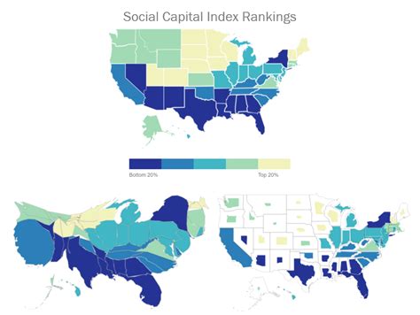
A cartogram is a type of map that distorts geographical shapes (such as countries, states, or provinces) based on a specific data variable. Typically, the areas on the map are scaled proportionally to the values of the data being visualized. This distortion allows for easy identification of areas with high or low data values.
Types of Cartogram
There are various types of cartograms, each with its unique characteristics:
- Density Cartogram: Distorts areas based on population density or other density data.
- Value Cartogram: Distorts areas based on the total or average value of a variable, such as GDP or life expectancy.
- Flow Cartogram: Visualizes the magnitude and direction of movement between different regions.
- Dorling Cartogram: A type of value cartogram that uses circles to represent regions, scaled proportionally to the data values.
Applications in Human Geography
Cartogram finds wide application in human geography, aiding in the analysis and visualization of a diverse range of data:
- Population Distribution: Identify areas with high or low population densities, highlighting population patterns and urbanization trends.
- Economic Development: Visualize differences in GDP, income levels, or poverty rates, providing insights into regional economic disparities.
- Health and Well-being: Map the distribution of health indicators, such as life expectancy or disease incidence, to identify areas of concern and disparities.
- Migration Patterns: Track the direction and magnitude of human migration flows between different regions.
- Land Use: Analyze land use patterns by distorting areas based on the percentage of land used for different purposes, such as agriculture, industry, or residential development.
Tips and Tricks for Creating Effective Cartograms
Creating visually effective cartograms requires careful planning and execution. Here are some tips and tricks:
- Choose the Right Data: Select data variables that are relevant to the topic and that benefit from spatial visualization.
- Determine the Distortion Method: Experiment with different distortion methods to find the one that best highlights the data patterns.
- Use Clear Colors and Labels: Optimize the color scheme and labeling to make the map easy to understand and interpret.
- Consider the Context: Provide appropriate context, such as a legend or scale bar, to help users understand the data presentation.
Pros and Cons of Cartograms
Like any other data visualization technique, cartograms have their advantages and limitations:
Pros:
- Visually emphasizes data patterns and relationships.
- Makes it easier to compare and identify outliers and disparities.
- Can be used to reveal hidden trends and connections.
Cons:
- Can distort the geographical accuracy of the map.
- May be less effective for visualizing data with a wide range of values or complex spatial patterns.
- Can be challenging to create and interpret correctly.
Frequently Asked Questions
Q: What is the difference between a cartogram and a choropleth map?
A: A cartogram distorts geographical shapes based on data values, while a choropleth map uses color shades to represent data values in different areas.
Q: How do you choose the appropriate distortion method for a cartogram?
A: The distortion method should align with the data variable and the intended purpose of the map.
Q: Can cartograms be used to visualize qualitative data?
A: While cartograms are typically used for quantitative data, they can also be applied to qualitative data by assigning values to different categories.
Q: How do you ensure the accuracy of a cartogram?
A: Verify the accuracy of the data used and carefully consider the distortion method and scale to minimize geographical distortions.
Table 1: Population Density Cartograms by Region
| Region | Population Density (per sq. km) |
|---|---|
| North America | 23 |
| South America | 25 |
| Europe | 34 |
| Asia | 37 |
| Africa | 41 |
Table 2: Economic Development Value Cartograms by Country
| Country | GDP per capita (USD) |
|---|---|
| United States | 63,416 |
| China | 12,551 |
| India | 2,277 |
| Brazil | 6,899 |
| Nigeria | 2,027 |
Table 3: Migration Flow Cartograms by World Region
| Region | Net Migration Rate (per 1,000 population) |
|---|---|
| North America | 8 |
| South America | 3 |
| Europe | 10 |
| Asia | 2 |
| Africa | -1 |
Table 4: Land Use Dorling Cartograms by Land Type
| Land Type | Percentage of Land Area |
|---|---|
| Agriculture | 50% |
| Forest | 20% |
| Urban | 10% |
| Water | 10% |
| Other | 10% |
Conclusion
Cartogram stands as a valuable data visualization tool in human geography, providing unique insights into spatial patterns, relationships, and disparities. By understanding the principles and applications of cartograms, researchers, policymakers, and students can effectively communicate complex geographical information in a visually compelling way, contributing to informed decision-making and a deeper understanding of the human landscape.